Insights
In 2009, Crunch’s affordable, user-friendly online service changed the accountancy game for good. The company has grown to become a top 100 accountancy firm with over 10,000 active customers and an offer that extends beyond accounting for small businesses and the self-employed.
During 2016, Crunch launched an extended series of products and services, from investments and pensions to mortgages and insurance. The business had fundamentally evolved. Its brand needed to as well.
LOGO
![]()
A bold name like Crunch needs no frills. At the heart of the new identity, we put a confident, friendly, professional logo, with the versatility to use the ‘C’ as a favicon and social media icon.
The company’s passion and sense of fun is conveyed in the contemporary logo font and fresh colour palette.
With lots of white space, clear messaging and room to breathe, the identity breaks with the grey and boring image of accounting and communicates a vital energy to Crunch’s audience of free thinkers and entrepreneurs.
Primary COLOURS
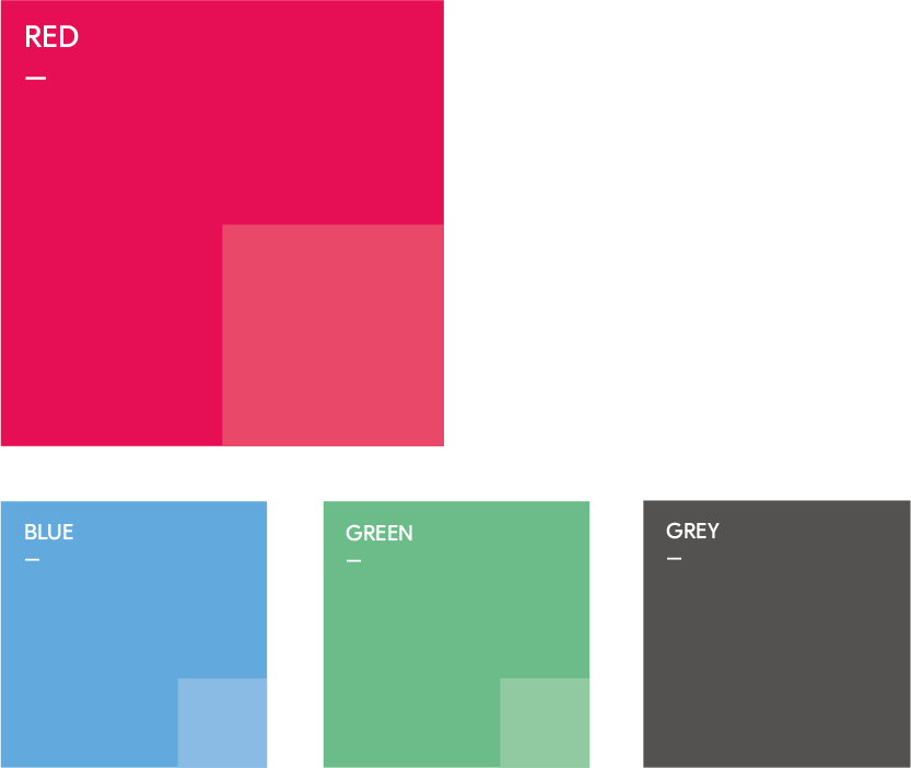
Passion red is, naturally, the first-choice colour, accented by blue and green, with white and dark grey used for text and icons.
Secondary COLOURS

The secondary palette of soft tints plays an important background role (much like any good accountant!).
Stationery
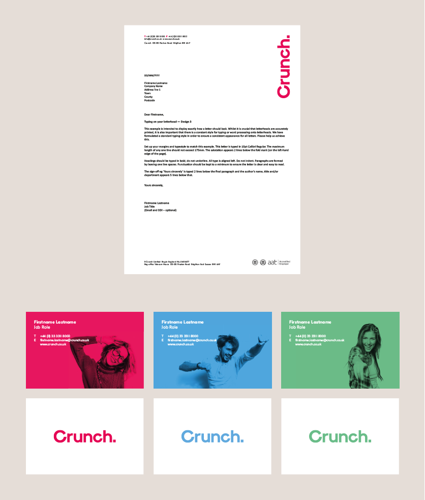
Here’s a snapshot of the brand identity in action on their stationery… the roll-out continues across all their communications.