Empoura
Premium online lingerie emporium
The brand’s name – our first challenge – is linked to the word empower, empowering women to express their sensuality and channel lasting body confidence through premium luxury lingerie. Empoura is more than just lingerie, it’s a lifestyle. And with that comes the power of feeling confident, beautiful and unique.
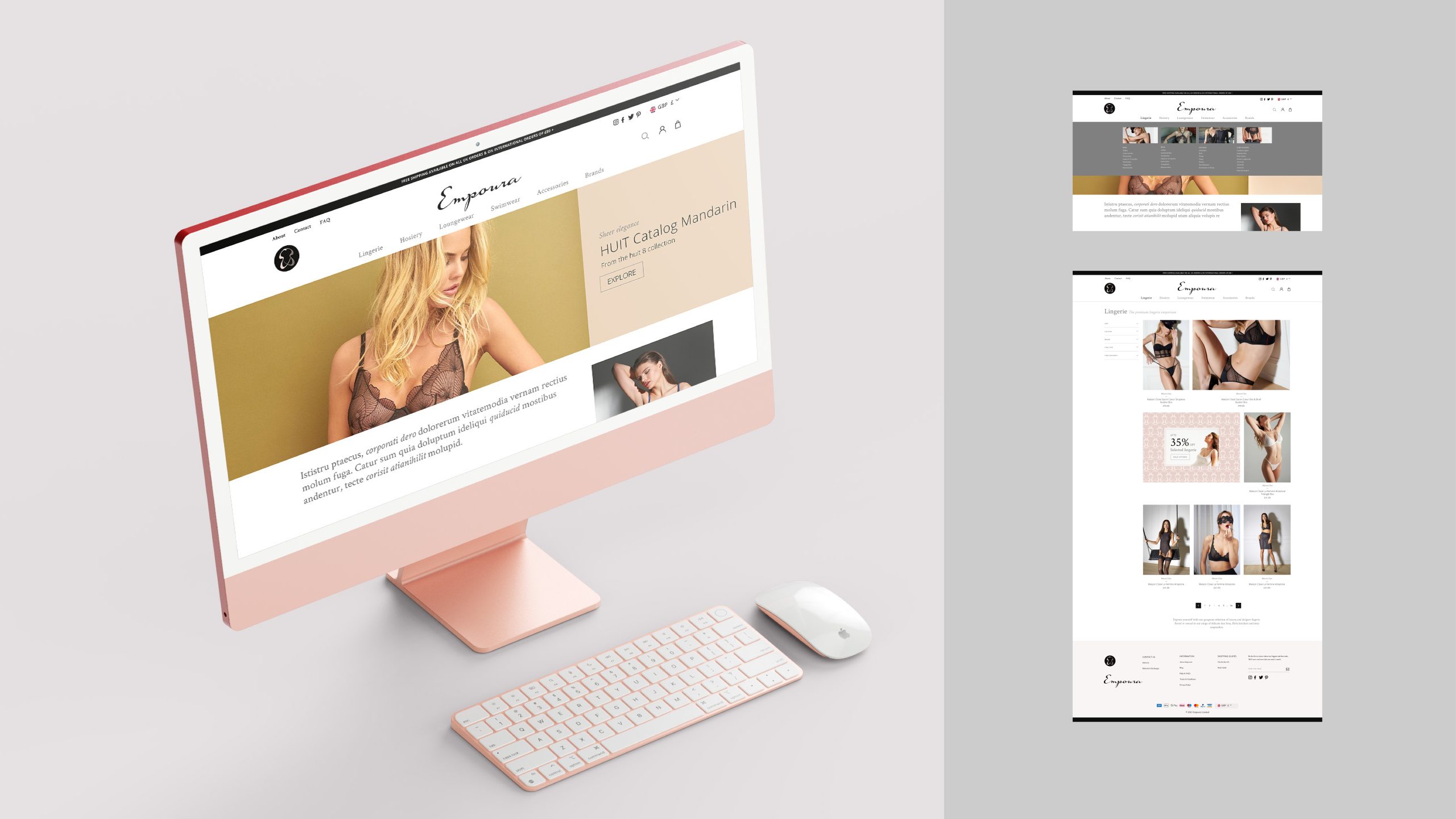
Clarification of this strategic positioning, a new name, logo, visual identity and website design was required. As an online business, the brand had to work to attract higher spending customers, ensuring all aspects of the brand’s communications were aligned to the strategic positioning.
BRAND RESEARCH
NAME DEVELOPMENT
LOGO & VISUAL IDENTITY
WEBSITE DESIGN CONSULTANCY


The Empoura symbol was formed to reflect the shape of a female silhouette, with symbolic curves and lingerie straps. The mirrored ‘E’ letters combine to create a subtle, sensual indication of the brand’s intimate nature. We chose to use two ‘E’ letters to represent a double-meaning – empowerment and confidence met with a playful, exotic vibe – day and night. When linked together, the symbol creates a sophisticated pattern resembling lace, closely associated with lingerie. The interaction between the two shapes implies a connection or embrace, interlocking as one physically, suggesting again the sensual empowerment of the brand.


“We’re so happy with the presentation. Absolutely love the name ‘Empoura’ and one of the main reasons is that it’s come from the word ‘Empower’ and therefore links to ‘Empowering women’.
The logo/symbol is PERFECT. Completely different to what was expected (we of course didn’t know what to expect). The Empoura visual side works beautifully, and the Open sans font looks great. Thank you SO much, we’re delighted!”

Luxury Lingerie from
empoura.com