Insights
![]()
CACI is a successful technology business that designs innovative and practical IT solutions.
One of their software products named OfficeBase no longer reflected the nature of the product. Originally, an Office based solution but increasingly used by a mobile workforce, the original product name had serious limitations in terms of its overall brand and for generating new business.
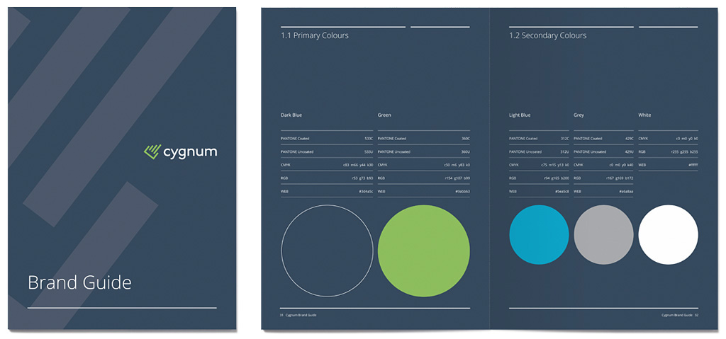
The new name ‘Cygnum’ was chosen and a simple, modern logotype designed. The C for Cygnum ‘pointer’ symbol was crafted to reflect increasing efficiency through three diagonal bars.
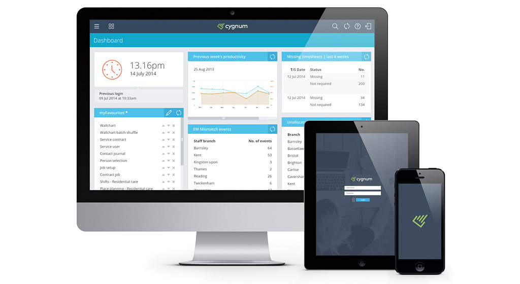
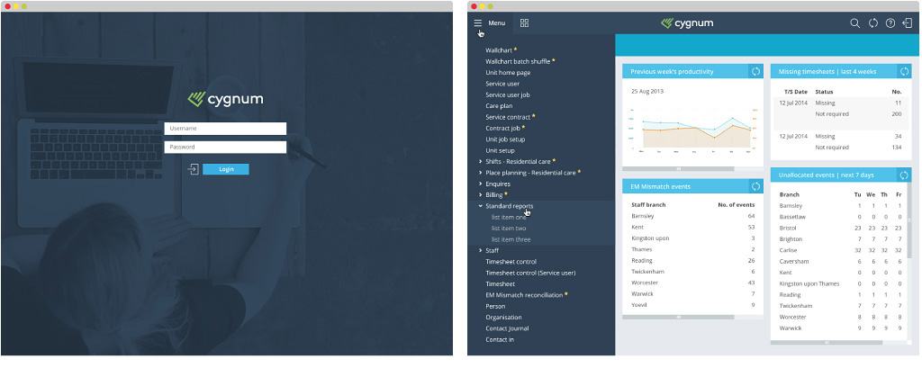
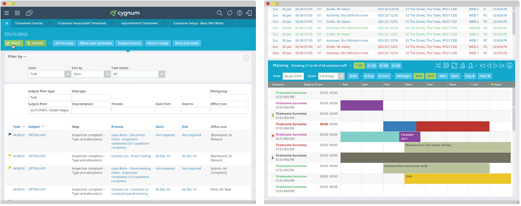
In addition to the rebrand, we designed the UI of the software to modernise and reflect the quality of the product as well as the brand’s identity. A clean, contemporary and fresh interface has been achieved that enhances the user experience and transforms the brand for the 21st century.
We’re absolutely delighted with the new look and feel, thanks so much to the whole team for all your hard work. The slick new design got an immediate thumbs up from everyone internally who needed to approve it, which shows how well you nailed the brief. It looks great and now it has been launched to the wider Enterprise Solutions team, they are all well bought into it too.
Marie Phillips | Head of Marketing
CACI