Insights
I’ve never considered wearing a bow tie, but since the discovery of accessories label Charles Olive, the prospect suddenly seems an attractive one. Not merely due to aesthetics, but also the quirky origin of their prints.
I’ve never considered wearing a bow tie, but since the discovery of accessories label Charles Olive, the prospect suddenly seems an attractive one. Not merely due to aesthetics, but also the quirky origin of their prints.
Surprising as it may sound, the prints on these patterned bow ties have been designed using an Excel spreadsheet! I’m sure any designer will agree, the very thought of the words ‘design’ and ‘Excel’ residing in the same sentence is unsettling, and yet the collection is quite the opposite of offensive. In addition to the pleasing prints, the bow ties are handmade in Britain, which makes me not only want to purchase one, but wear with pride. Bravo Charles Olive.
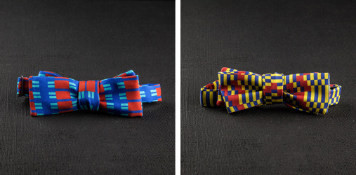
Available at http://www.darkroomlondon.com/shop/designers/charlesolive
More about the label here http://charlesolive.com/about/
Another clever design for Walkers’ new nuts range TigerNuts when I saw this I was immediately drawn to the product name which is spelt out on the pack using type that morphs into the face of a tiger.
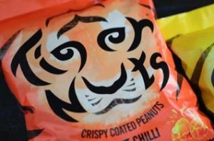
The colours of the bags, the illustrative design used to recreate the markings of a tiger and the typeface used cleverly comes together to give that all important impact on the shelf and instant brand recognition. See if you can spot the bags when you’re next at the supermarket!
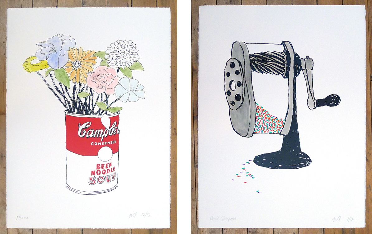
Bob Gill (of Fletcher/Forbes/Gill later renamed Pentagram) in collaboration with The Print Club London has produced 6 new prints, each hand finished in watercolour by Bob himself. The work will be exhibited at the Print Club Gallery, Dalston from the 28th of March onwards.
![]()
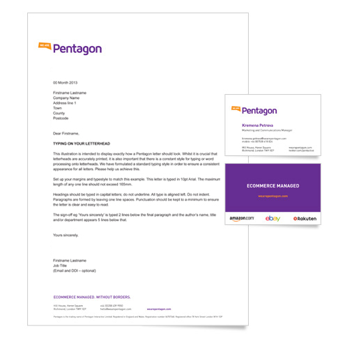
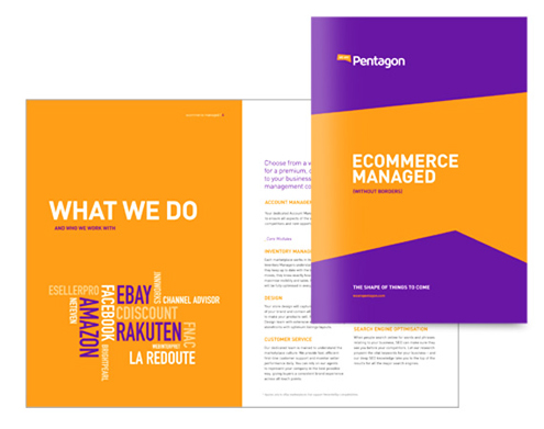
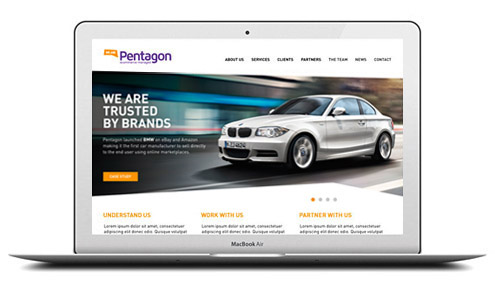
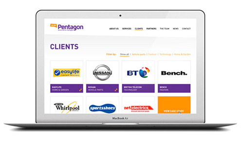
Pentagon is a market-leading ecommerce service provider helping businesses sell more online. They approached VGROUP to realign and communicate key messaging to each client and partner sector.
We worked with senior management to define their Vision, Mission, Values and Brand Promise, and to capture their personality in their visual identity and tone of voice. Engaging their employees (165 and growing fast) with clarity and positive brand guidelines was an essential part of this project in order to make everyone feel as ‘one team’.
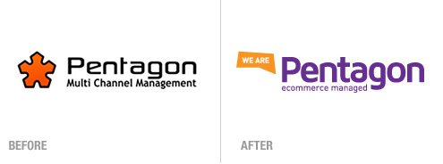
We created a new logo and strapline, ‘Ecommerce Managed’; designed their logo and visual identity; developed a sign-off for advertising, ‘The shape of things to come’ and recommended a new domain name, wearepentagon.com which formed the big idea for the new logo and messaging. As part of the solution we also incorporated an irregular pentagon device which was used across all marketing materials.
Clear concise copy was written by VGroup for the marketing materials, and as this was recognised as a key asset to the brand, a Brand Language Guide was supplied to the client so they could follow it when writing additional copy for case studies or content using the CMS on their website.
Thank you for all the work on the branding. We received only positive reactions from the Team at the internal launch. It was a pleasure working alongside you throughout the whole process. Thanks for all your hard work.
Laurence Guy | Pentagon
CEO