Insights
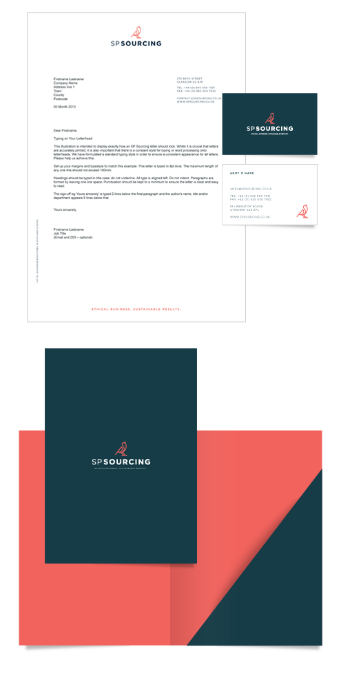
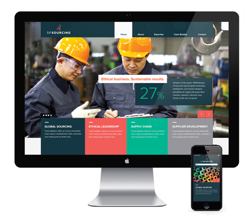
SP Sourcing offers proven expertise, visionary thinking and an ethical outlook to generate prosperity and sustainable value for all stakeholders in the supply chain. VGROUP were approached to develop their brand in line with the four key areas of expertise:- Global Sourcing, Ethical Leadership, Supply Chain & Supplier Development.

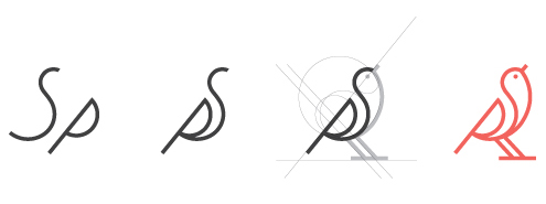
We created a new logo, strapline and visual identity, with special emphasis on the development of a meaningful icon that would communicate the values and personality of the brand. During the early stages of brainstorming, a correlation between SP Sourcings’ Brand truths and the behavioural nature of a bird became clear. The icon was constructed using the SP letterforms to include an upward angle that emphasises the positive service that SP Sourcing provide.
After research on SP Sourcings’ competitors, we devised a primary colour palette of dark blue and coral. These colours convey a professional edge with a warmth that communicates the ethical nature of their business. Aqua and grey were chosen as the secondary palette, injecting the assertive, visionary and technological aspect of their brand values and personality.
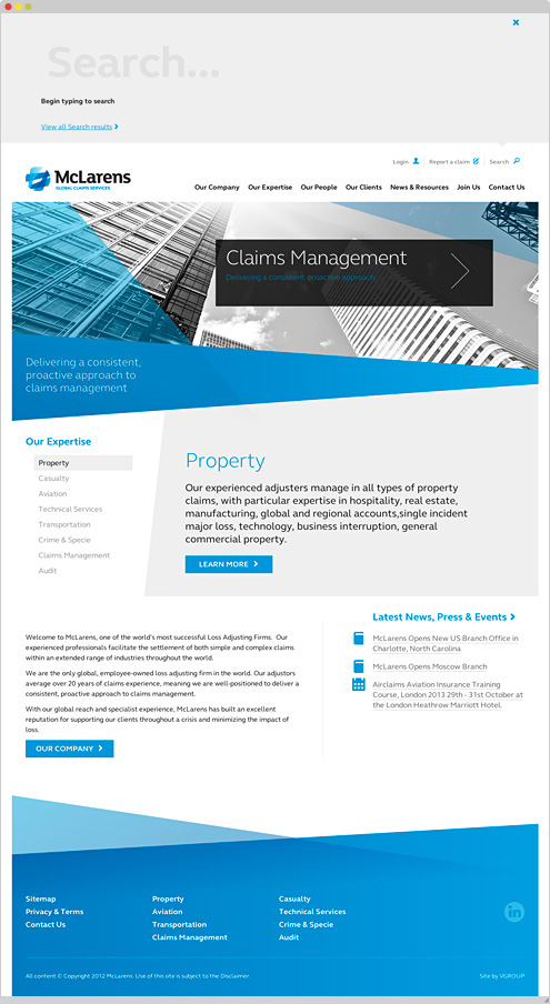
As part of our rebrand for McLarens, the Global Claims Services Group, we have designed and developed websites for McLarens and Airclaims to build their online presence around the world.
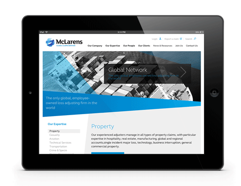
Both sites follow a similar clean and modern design aesthetic, complementing the off-line communications we have produced. Using crisp black and white imagery, balanced with the electric blue colour palette and strong typography, the site presents the company’s services and information to both clients and potential clients in a clear and concise way.
Our initial research into the performance of McLarens’ original websites revealed that the staff directory was a popular feature with their client base. In its original form it was convoluted and hard to use, so we developed a more usable version with predictive search functionality that allows users to find staff easily by simply typing the first few characters of their first name or surname.
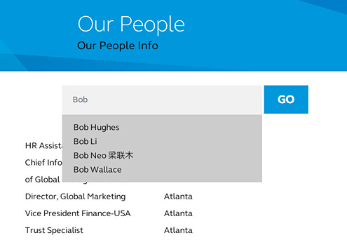
Predictive search function
McLarens also had existing backend systems that handled claims online. We have helped to bring these systems in-line with the new look-and-feel, integrating them seamlessly into the new site.
Typographic styles and Iconongraphy
Working with our development partners, we built the websites on the Expression Engine Content Management System, taking advantage of its extensive feature set, reliability and also the ease with which a client can create and edit content within this system.
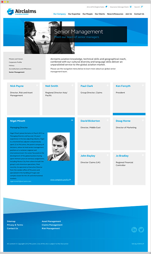
Airclaims, being part of the McLarens Group of companies, adopted the same design aesthetic but we provided some bespoke design templates to accommodate their own requirements.
Through a contemporary new brand image and dynamic websites, we have delivered McLarens and Airclaims a platform that will support their drive forwards and position them where they want to be…
…McLarens – one of the world’s most successful loss adjusting firms, and Airclaims – the world’s leading provider of claims, risk and asset management services to the global aviation industry.
At five years old, Christian von Koenigsegg was inspired to design his dream sports car. Some 17 years later, with extraordinary determination and vision, he did just that, naming his creation the Koenigsegg.
In this interview he talks about his design philosophy and vision. What he’s created is surely a work of art and truly an inspiration, not only for anyone interested in design, but for people who believe that anything is possible providing you want it enough.
ARVE error: maxwidth: 800px is not valid
ARVE error: maxwidth: 800px is not valid
Apple has launched a global brand campaign, ‘Designed by Apple’, at least partially in an effort to win back market share from competing smartphone manufacturer Samsung. The campaign brings the focus back to the company’s core values, telling the story of the long process involved in developing the perfect concept. A clear distinction, the campaign implies, between this process and the loveless churning of new products adopted by other electronics manufacturers.
This emotive TV advert, along with a series of press ads, will remind fans why they love Apple, and probably go a long way to convincing some non-believers too: that’s the power of the brand.