Insights
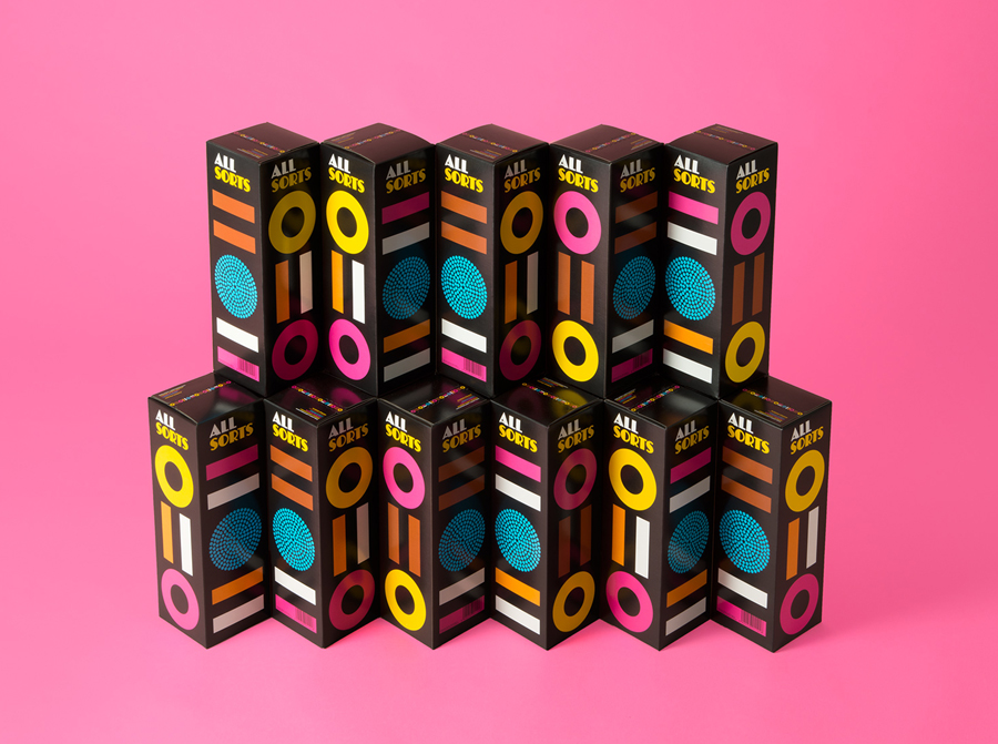
Our designers will be even more partial to sharing a bag or two of liquorish Allsorts when they see the new vibrant packaging, which reveals the “distinctive shapes and colours of the liquorish” designed by Helsinki based studio Bond. We’re sure that if they’re anything like us will have consumed a lot of sweets in the name of research!
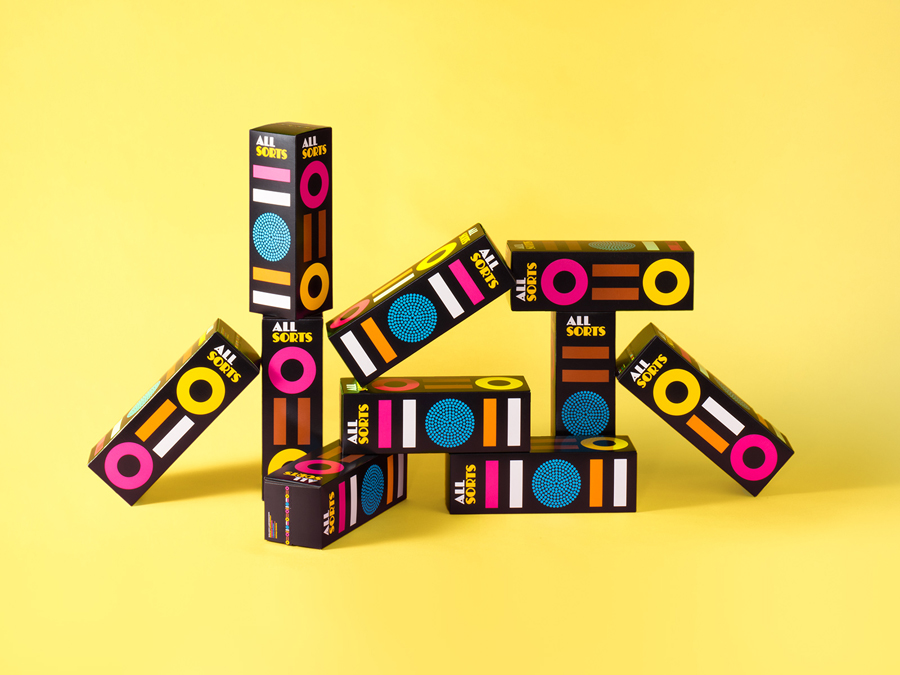
The sound of rustling packets in the afternoon has become all too familiar recently with our studio’s continued weakness for Allsorts. And we’re sure the new packaging design by Bond Creative will fuel their love for liquorice even more. Appealing to the taste buds as well as the eye, Bond have successfully designed packaging that communicates the unmistakeable contents with simple, iconic detail in bright colours which really pop on the black background of these lovely little boxes. Described by Bond as a “bold and playful packaging design that allows consumers to easily identify the different varieties”. We couldn’t agree more!
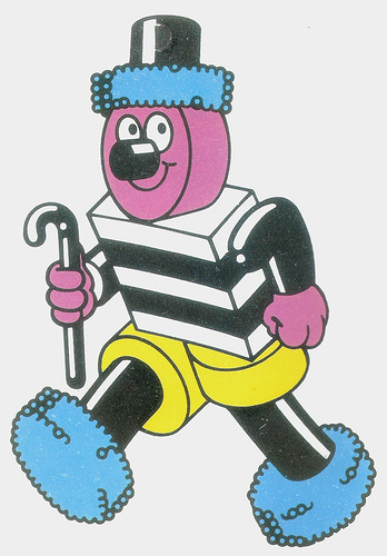
I bet some of you will still remember Bertie Basset:
I came across this website recently that graphically represents what’s happening in one second on the internet. I think this internet thing might just catch on. 🙂
Sometimes lateral thinking really pays off. This short film from American Giant on their brand is a brilliant piece of copywriting that combines attitude with life experience.
The fact that life shouldn’t be too ‘comfortable’ because you don’t really achieve anything; being comfortable won’t get the hands dirty; comfortable has nothing to prove; comfortable can’t get the job done – and yet wearing comfortable clothes is cool. Don’t get comfortable mentally but be comfortable physically. Brilliant.
http://www.american-giant.com/brand-film-dont-get-comfortable
The Sussex Community NHS Trust approached VGROUP to give their Care Without Carbon scheme a logo and visual identity, ensuring it became as visible as it is vital to the Trust.
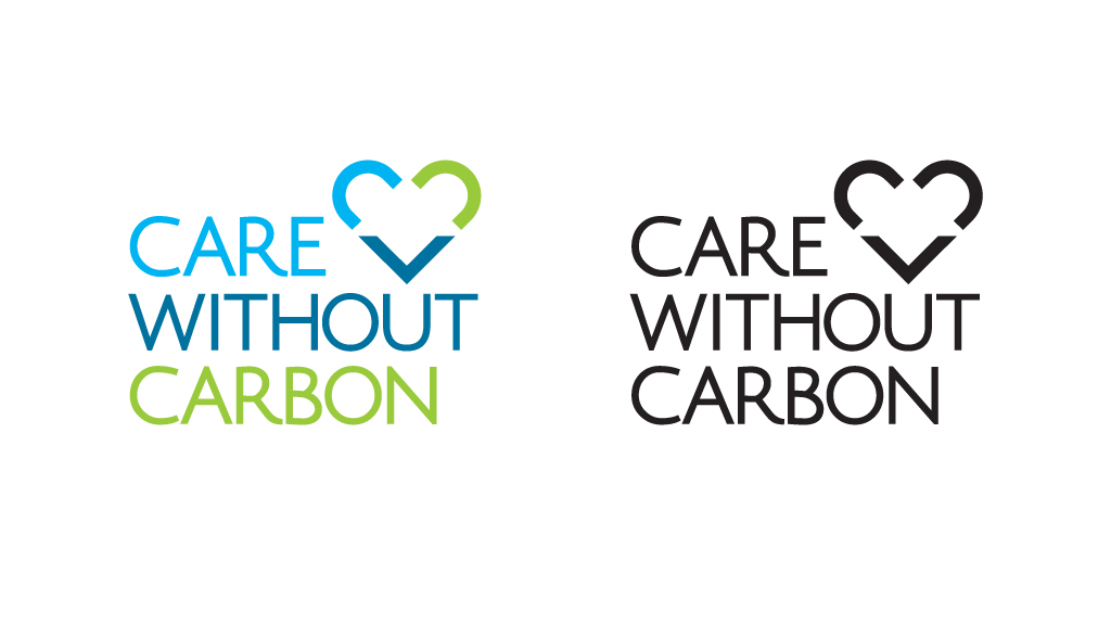
Aiming to be the leading NHS Trust for sustainability in the country, and with a dedicated sustainability team, the Sussex Community NHS Trust is truly committed to reducing its carbon footprint, benefitting staff, stakeholders and the 9,000 patients that are treated in Brighton & Hove and West Sussex each day.
Despite winning the prestigious Health Service Journal Good Corporate Citizenship Award for their carbon footprint reduction last year, a caring and inspirational brand was required to raise awareness within the Trust.
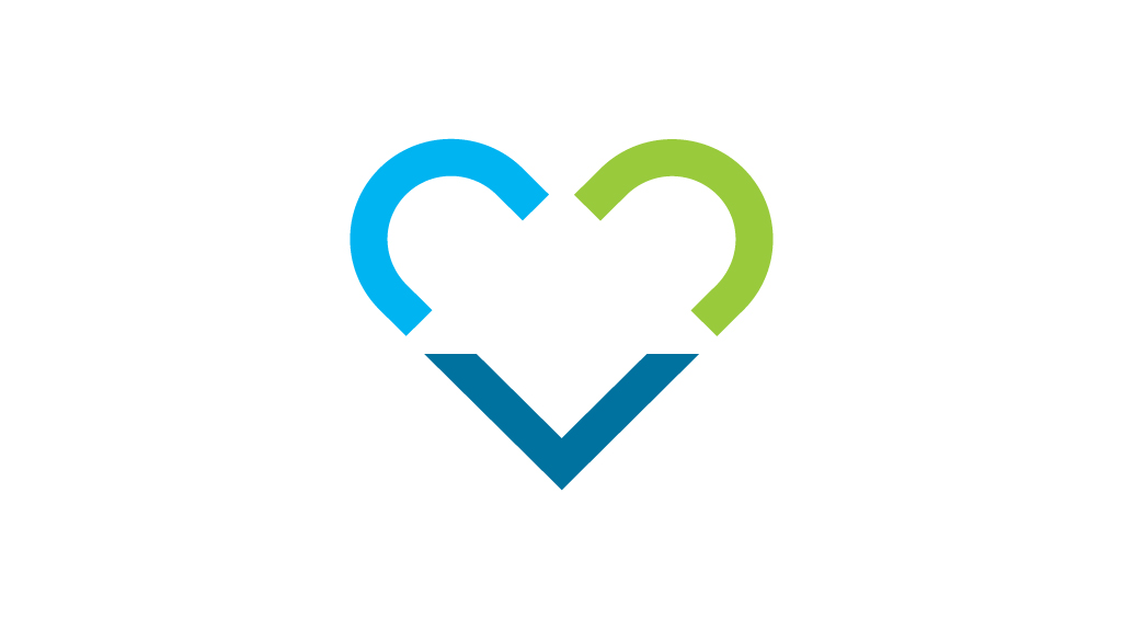
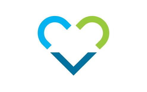
A classically emotive heart symbol was created containing two “c’s” for “Care” and “Carbon” and a downward arrow to represent “Without” which together forms a heart. There is also a large white upward arrow formed from the negative space between these elements to represent positive change. The blue arrow in isolation will eventually become a useful element once the brand becomes recognisable.
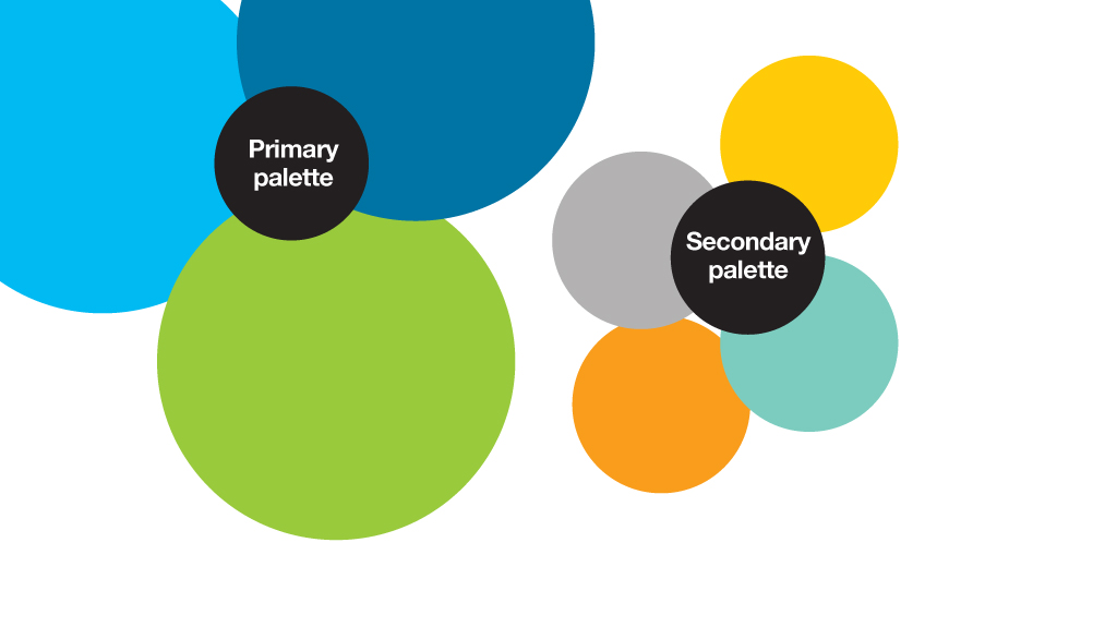
A colour palette was chosen that reflected both the healthcare system and the environmental goals and promises of the scheme. We needed to be careful that the new brand, palette and bespoke illustrations would work well alongside the suite of NHS logos and style, yet still have standout.

With the brand, visual identity and guidelines in place the next phase of the project, will include a full campaign plan, awareness phase and the creation of tools to put everything into action and help the Sussex Community NHS Trust reach their ambitions goals.