Insights
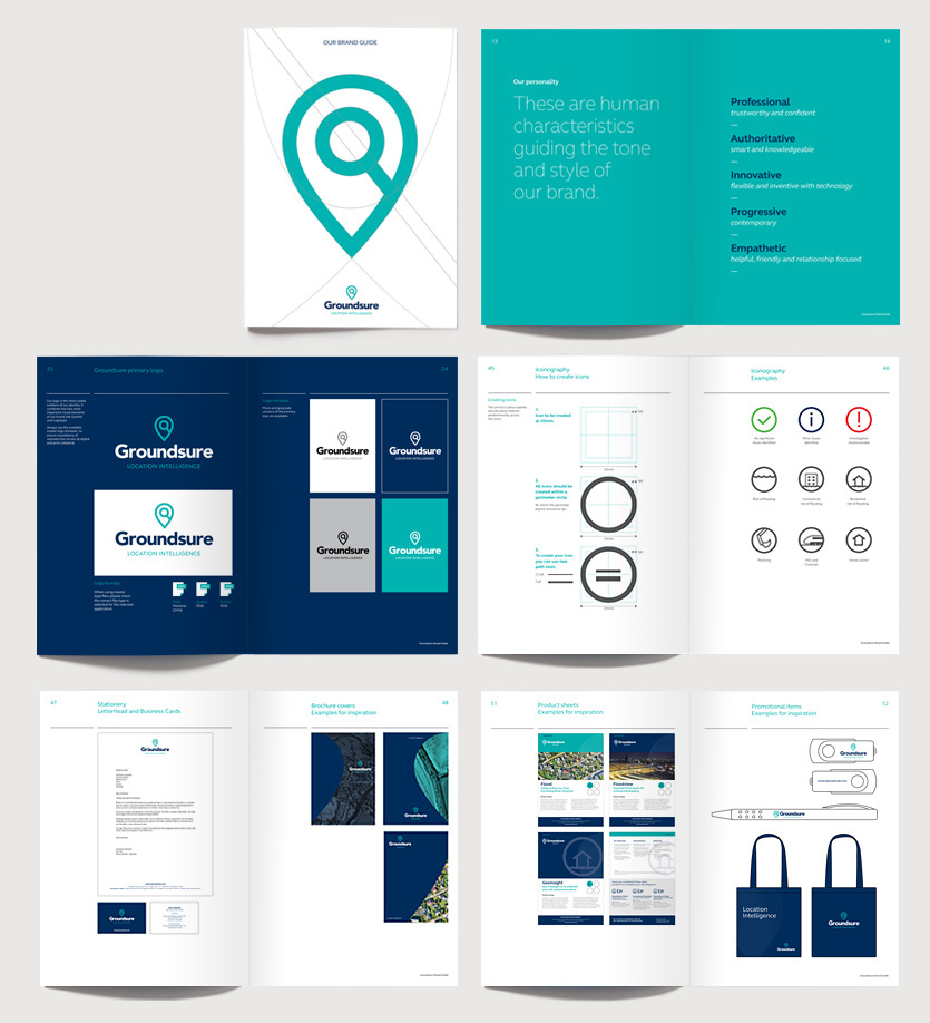
VGROUP has rebranded Groundsure, “The No.1 provider of Location Intelligence to the UK property and land use market.” New values, proposition and positioning, new logo, visual identity and brand guidelines…

Groundsure (a 4C company) started in 2001 offering paper-based environmental search reports to the legal conveyancing profession. It was acquired by EMAP (now Top Right Group) in 2007 and in 2013 they launched .MAP to provide mapping and data for architects, surveyors and environmental consultants.

As the environmental search and land use market was changing fast, Groundsure needed to change the customer conversation. We advised Groundsure to play to their strengths and amplify their beliefs. We developed a brand matrix to help staff embrace and deliver their values, creating a common sense of purpose and alignment with a single, shared vision and clear positioning statement:

With Groundsure being the hero brand .MAP brand became ‘Groundsure Insights’ and the environmental reports service ‘Groundsure Searches’. We designed a new logo/symbol by combining the ubiquitous magnifying glass search icon within the iconic geo-location pin, thereby capturing the essence of ‘Location Intelligence’.

Today, their fresh new visual identity is aligned to a robust brand proposition and messaging, brand toolkit and brand guidelines, Groundsure’s marketing team are now able to deliver a more brand-led approach to marketing the business and support future growth ambitions.
We feel that having a slick and coherent brand is essential to the future of Groundsure. We had not revisited our brand since launch 8 years ago and with the addition of .Map in 2013, we needed to clarify the brand hierarchy and story for our customers. My objective with the brand review was to understand and define our brand essence as well as develop and enhance our visual identity. We needed a brand agency who could really get under the skin of our company, industry and customers. The chosen agency would have to hit the ground running understand our past and help us deliver our future. VGROUP did just that, they just got us. They worked with us seamlessly and effectively as an extended part of our Team from project start to finish. The brand book they have produced has been amazingly well received by the staff and stakeholders. The work VGROUP has done for us makes the marketing Team’s job easier and delivery better. Thank you VGROUP – I would recommend you to anyone.
Rebecca Manville
Marketing Director
Groundsure

CACI is a successful technology business that designs innovative and practical IT solutions.
One of their software products named OfficeBase no longer reflected the nature of the product. Originally, an Office based solution but increasingly used by a mobile workforce, the original product name had serious limitations in terms of its overall brand and for generating new business.
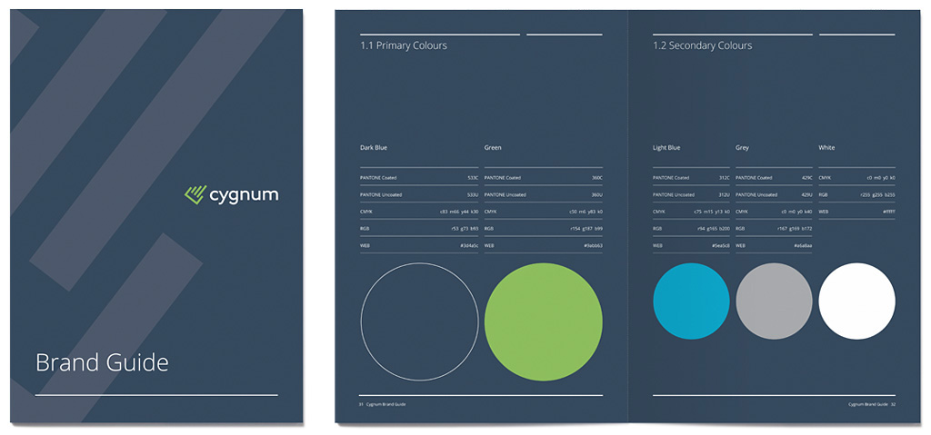
The new name ‘Cygnum’ was chosen and a simple, modern logotype designed. The C for Cygnum ‘pointer’ symbol was crafted to reflect increasing efficiency through three diagonal bars.
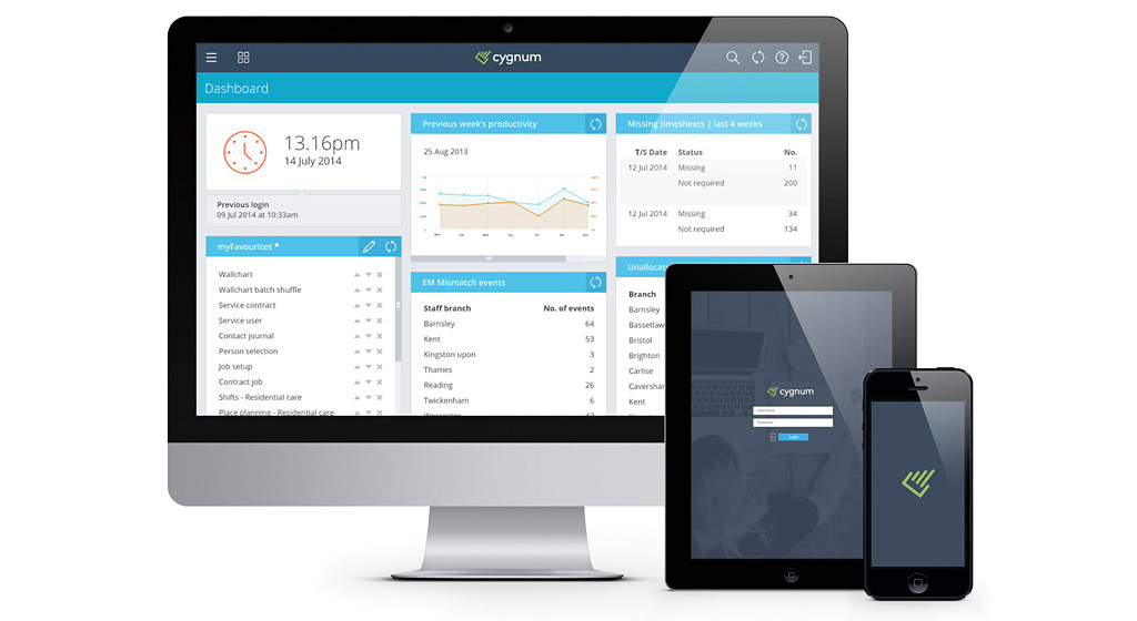
In addition to the rebrand, we designed the UI of the software to modernise and reflect the quality of the product as well as the brand’s identity. A clean, contemporary and fresh interface has been achieved that enhances the user experience and transforms the brand for the 21st century.
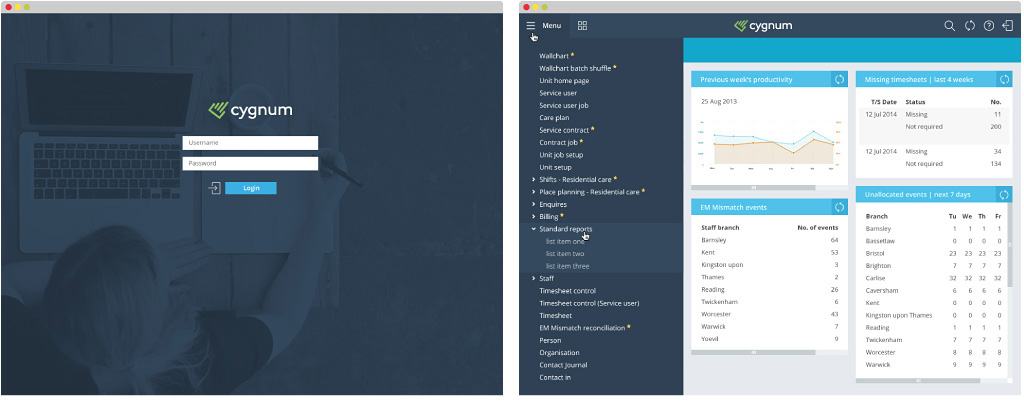
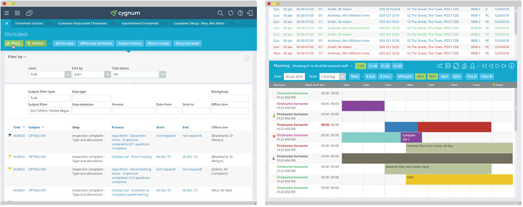
We’re absolutely delighted with the new look and feel, thanks so much to the whole team for all your hard work. The slick new design got an immediate thumbs up from everyone internally who needed to approve it, which shows how well you nailed the brief. It looks great and now it has been launched to the wider Enterprise Solutions team, they are all well bought into it too.
Marie Phillips | Head of Marketing
CACI
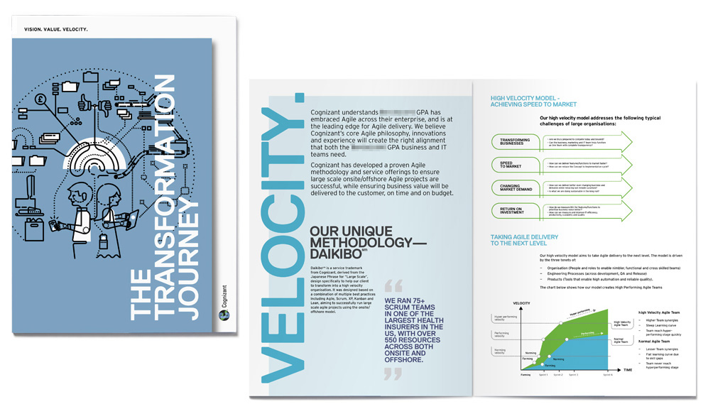
Cognizant, a global leader in business and technology approached VGROUP to help them transform a new business proposal into eye-catching presentation that would help them stand out from the competition. Having immersed ourselves in the subject matter we commissioned a bespoke illustration to communicate the main concept of the presentation that also set the style for the info graphics and diagrams.
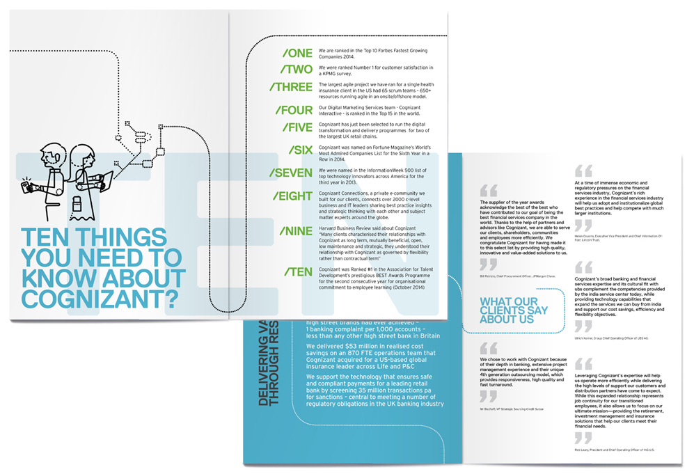
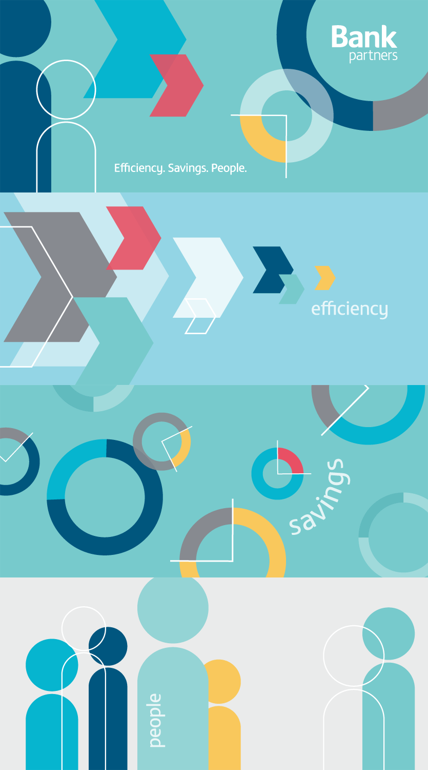
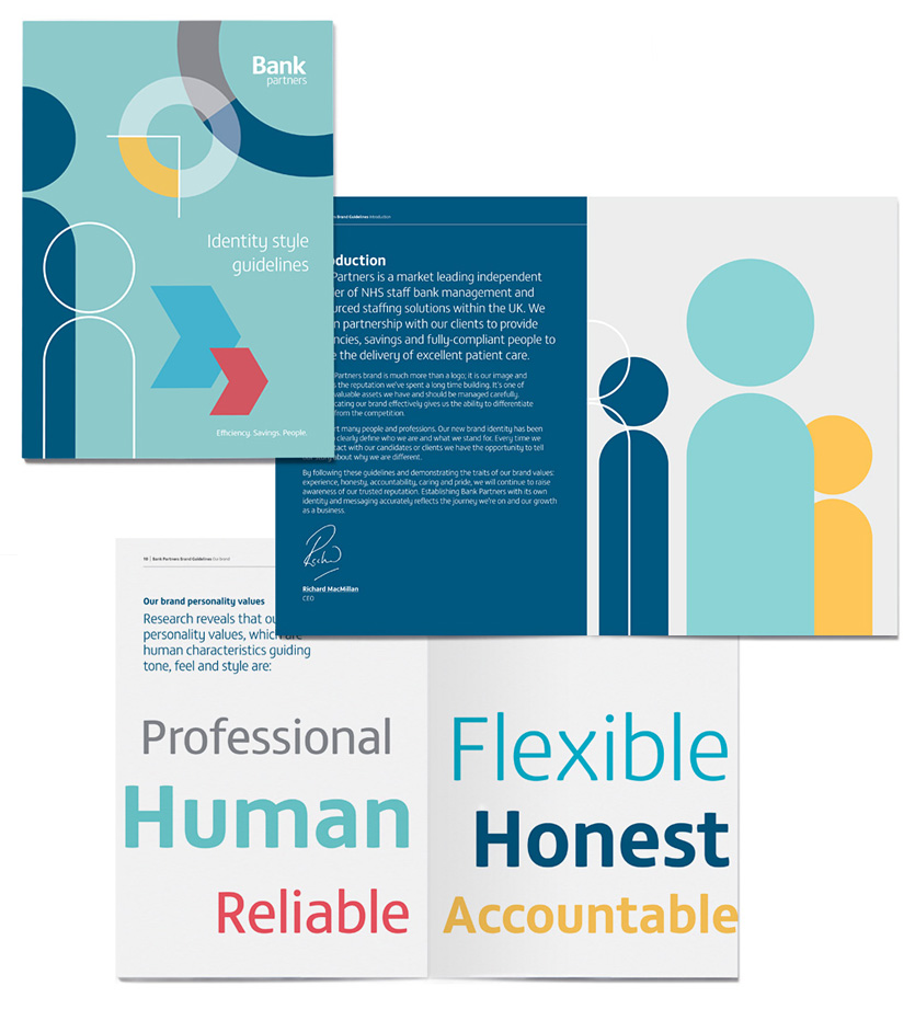
VGROUP were asked to refresh Bank Partners’ visual identity and to align it to its vision to be the UK’s market-leading independent provider of NHS staff bank management and outsourced staffing solutions.
We began by identifying their vision, mission, values, and core insight. Key messaging was developed and a brand language guide followed which was then supported with website and brand design guidelines.
Bank Partners is the name for the staff bank management division of Pulse, so it was important to retain a visual link through the logotype. However, a striking visual identity using icons and contemporary colours now gives the brand a distinctive and unique personality; open, friendly and professional with a human quality to capture three key elements of the brand – Efficiency, Savings and People.
